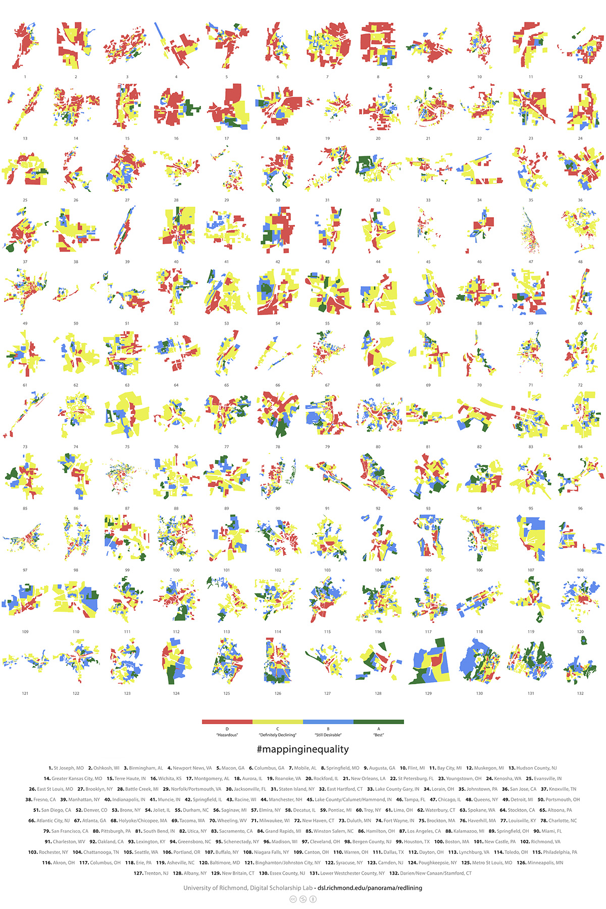
This poster shows small multiples of cities at the neighborhood level, graded by the Home Owners Loan Corporation. Known as HOLC, the organization created “security maps” that color-coded, graded, and identified credit worthiness and their risk of defaulting on mortgage loans in cities across the U.S between 1935 and 1940. They ranked cities from most “Hazardous” (1. St Joseph, MO) to “Best” (132. Darien/New Canaan/Stamford, CT) based on the amount of area designated A, B, C, or D.
Using 132 of the digitized “security maps” found in Mapping Inequality, each city is given a GPA based on the percent of total area for each grade. For example, if a city had 100% of its neighborhoods graded A, it would receive a 4.0. This provided a way to compare all the cities and place them in order from most “Hazardous” to “Best”. All cities were viewed at the same scale for layout purposes. Works of Nicholas Rougeux: Inspiration for the poster
Cartography is the practice of making maps by combining science, aesthetics, and various techniques. Aesthetics matter, for they can entice and allure. While culturally situated, we are drawn to pleasing visuals, infographics, and maps. The HOLC maps are no exception. They show vibrant colors overlaid on grey city streets. Stepping back, they seem to mimic abstract art with their irregular shapes and organic composition. This is deeply unsettling when maps represent inequality, racism, and oppression. As geographer John K. Wright reminded us as early as the 1940s, maps are nothing if not processes of simplification and amplification. Visual rhetoric like cartography often works holistically—we tend to absorb a map’s meaning as one overall feeling rather than reading it in a linear fashion as we would a more traditional written text. Even then as we move to read that map as a “text,” it tends to be hard to shake that initial feeling.
Like the power of visual pleasure, cartography often scrubs the world of its complexity, its messiness, and its nuance. In the case of the redlining maps, the beautiful colors and shapes risk obscuring the story of the lived experiences, struggles, and values of the real people who lived in and are living in these neighborhoods. While obscuring these stories is not necessarily the intention of the map’s creators, reception by real audiences in the medium of cartography is just as important as intention. Maps, then, have to be seen as useful fictions. This poster, for example, usefully brings a series of locations together into a fruitful comparison about the consequences of inequality; at the same time, we have to acknowledge that these maps classify and order these cities into a tidy narrative that is at heart much more complicated. We hope this poster highlights the complexities of cartography and engages users in a deeper conversation about these issues. I encourage you to join this larger conversation and better understand #mappinginequality at Mapping Inequality
Thanks to Lily Calaycay who contributed enormously to the creation of the poster and to Dr. Tim Barney for his expertise in Visual Rhetoric. Project by Nathaniel Ayers and Justin Madron.