Elections 1840 - 2008
Static maps on a page represent political change only with difficulty. Voting America sets American political history in motion. We juxtapose subtle pictures of the ways US voters have cast their ballots in presidential elections during the past two centuries. These animations, depicting more than forty presidential election cycles, reveal much about the gradual evolution and occasional sudden revolutions in American voting across the span of US history.
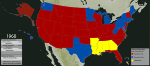
State-Level Popular Voting in Presidential Elections, 1840 - 2008
This map plots the winning candidate's party by state throughout presidential elections, illustrating state-level visualizations of electoral returns.
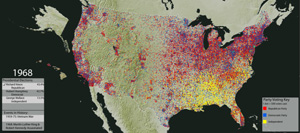
Dot Density Maps of Votes for President, 1840 - 2008
This map plots the raw votes cast in presidential elections. Color-coded by party, each dot represents 500 voters.
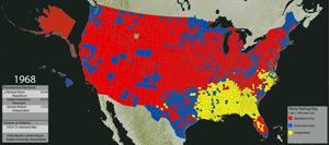
Counties Won in Popular Voting, 1840 - 2008
This map shows the counties won by each candidate throughout US presidential elections. It shows the shifting strengths of political parties, allowing users to see more granular distinctions between municipalities.
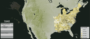
Percentage of Votes Cast for Whigs, 1840 - 1852
The percentage of votes cast for Whigs in presidential elections in each county is measured in these maps. They show the cross-sectional patterns of Whig party strength in the years before the party's collapse.
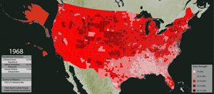
Percentage of Votes Cast for Republicans, 1856 - 2008
The percentage of votes cast for Republicans in presidential elections in each county is measured in these maps. They show how a sectional party emerged in the North and Midwest before the Civil War and the timing of its shift to a new geographic base in the second half of the twentieth century.
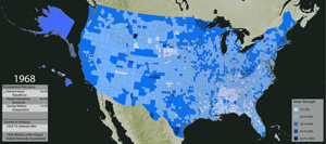
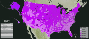
Percentage of Votes Cast for Democrats, 1840 - 2008
The percentage of votes cast for Democrats in presidential elections in each county is measured in these maps. Among other trends, they show the pace of the transition of the Democratic Party, from one based in the deep South to a party that derives much of its strength from urban areas along the Pacific coast and Northeast.
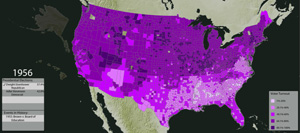
Third Party Voting in Presidential Elections, 1840 - 2008
This map plots the distribution of votes cast for presidential candidates outside the two main political parties in a given presidential election, with each dot representing 500 votes cast. Significant third party challenges have occurred sporadically throughout U.S. history, from the American Party in the 1850s to the candidacy of Ross Perot in the 1990s.
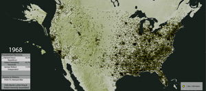
Presidential Elections Turnout, 1840 - 1972
This map shows the percentage of eligible voters, by county, who participated in the election in a given presidential contest. This map measures voter turnout against the population of eligible voters. Among other trends, it shows the dramatic decline of voter turnout beginning in the early twentieth century, particularly in the US South.
Presidential Elections Turnout, 1976 - 2008
This map shows the percentage of eligible voters, by county, who participated in the election in a given presidential contest. This map measures voter turnout against the total population since the election of Jimmy Carter in 1976. It shows the enduring regional patterns of voter turnout continuing into the most recent elections.